GRAPHIC DESIGN
Considering the rate that these spent grains are produced I wanted a product that would get purchased often and remain competitive with its competitors on the shelf. So the focused ideas / points of my design was to be bright, colorful, eye-catching, affordable looking and to represent the idea of a new life well.
Year
2018
The Solution
An upfront and afforable looking product to benefit consumers and represent the core idea of recycling spent grains.
Client / Purpose
University Project
The Problem
The Molsen Coors factory needs help repurposing spent grains produced during the brewery process.
The Nueva Vida (New Life) project was my response to the task of repurposing Brewer’s Spent Grains into a new product. The new brand represents a cooking oil featuring different flavours and alternative products. This involved branding and packaging design.
Project Type
Packaging / Branding
Software Used
Photoshop / Illustrator


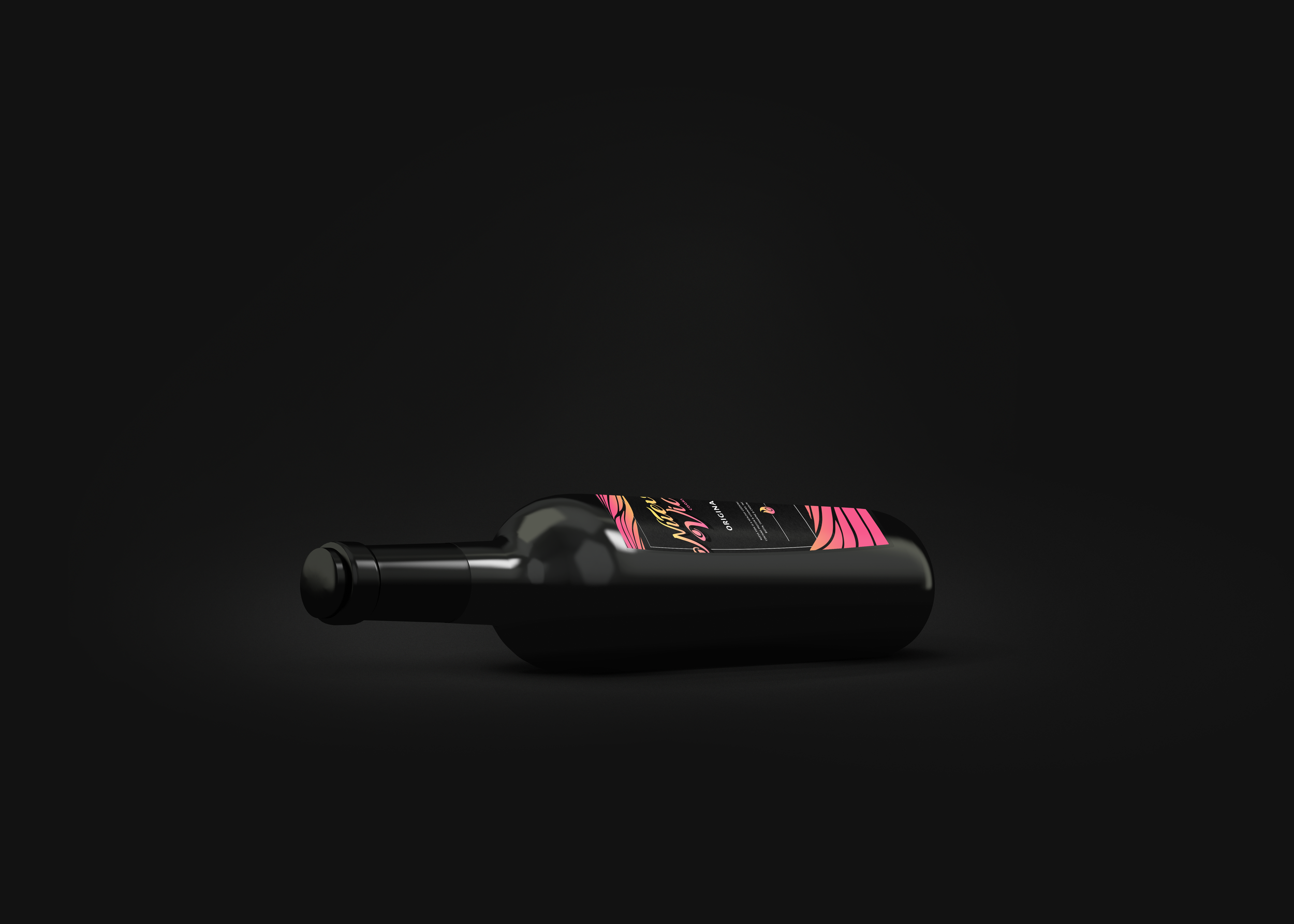
Alternative Packaging
To help visualize the way the brand might expand with different flavors and bottle designs in the future, I created alternative views of the packaging and considerations for how the design might translate to a shift in direction.
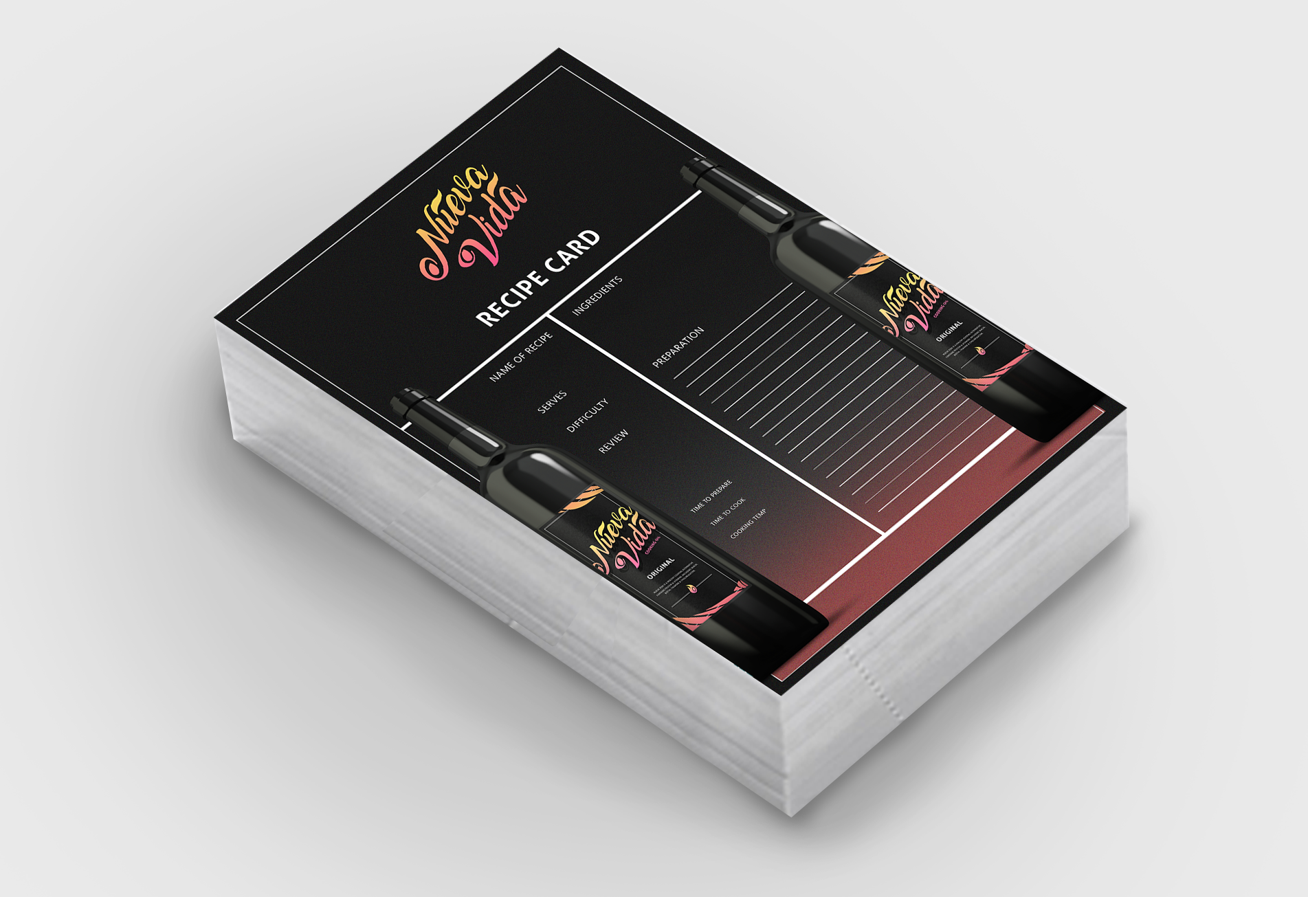
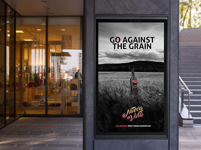
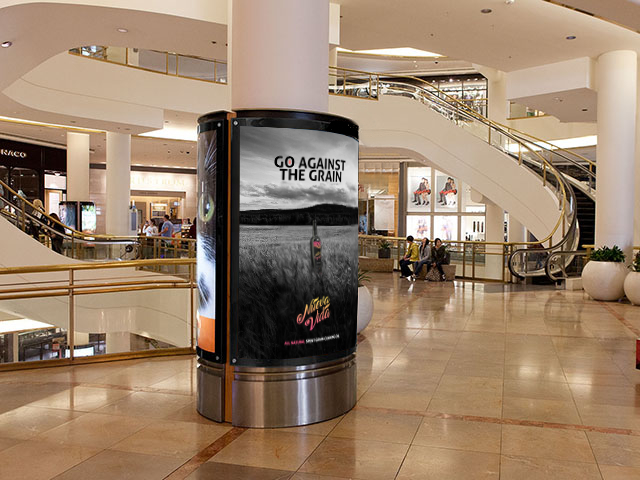

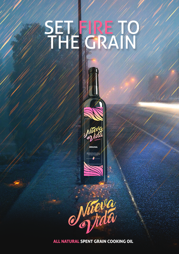
Posters & Recipe Cards
These posters and recipe cards were created to promote further engagement and visibility of the brand.
I produced literature as well as visuals for a walkable, travelling, turn-key style exhibition, a website, flyers and posters, invitational cards and a pamphlet to take home from the exhibition to accompany the exhibition itself. The pamphlet condensed some of the more complex points made in the literature produced for visitors of the exhibition.
Year
2018
The Solution
A simplified exhibition with visual explainers and engaging content to educate people with concerns or fears surrounding the topic
Client / Purpose
University Project
The Problem
Create an engaging campaign to educate the public on a lesser known issue
I was tasked with selecting a topic that I myself had little knowledge on and making the subject matter more palatable for a wider audience. I figured the best way to do this was through warm inviting and soft visuals that communicate their concerns and offer answers through a variety of interactive media.
Project Type
Packaging / Branding / Web Design
Software Used
Photoshop / Illustrator / HTML
Website Demonstration
This website was coded using basic HTML and CSS for demonstrational purposes.
People interested in the exhibition might book visits through this website, find relevant information and more.
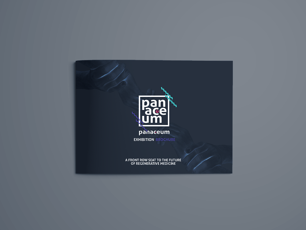

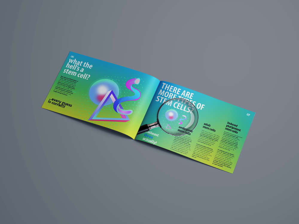
Invitations & Literature
Keeping consistent with the color theme used throughout the brand to represent stem cell research and development, I wanted to give people interested a positive introduction to an otherwise intimidating topic. I made sure to use larger, louder text and fonts to communicate quicker and prevent audiences from dismissing the material.


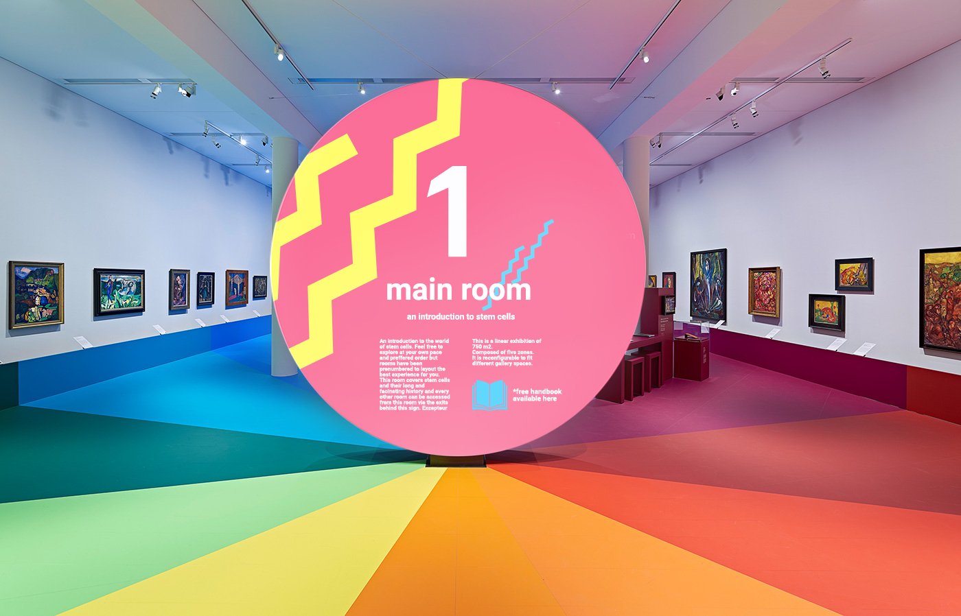
The Exhibition
I wanted the exhibition itself to be a reflection of the theme i developed through the literature. The idea was to introduce more interactive media here that audiences could turn into a more memorable experience, opening the door for things like demonstrations and further discussions. The use of symbols shown on the walls were a vague reference to the interchangeable thoughts and ideas concerning what these cells are capable of.
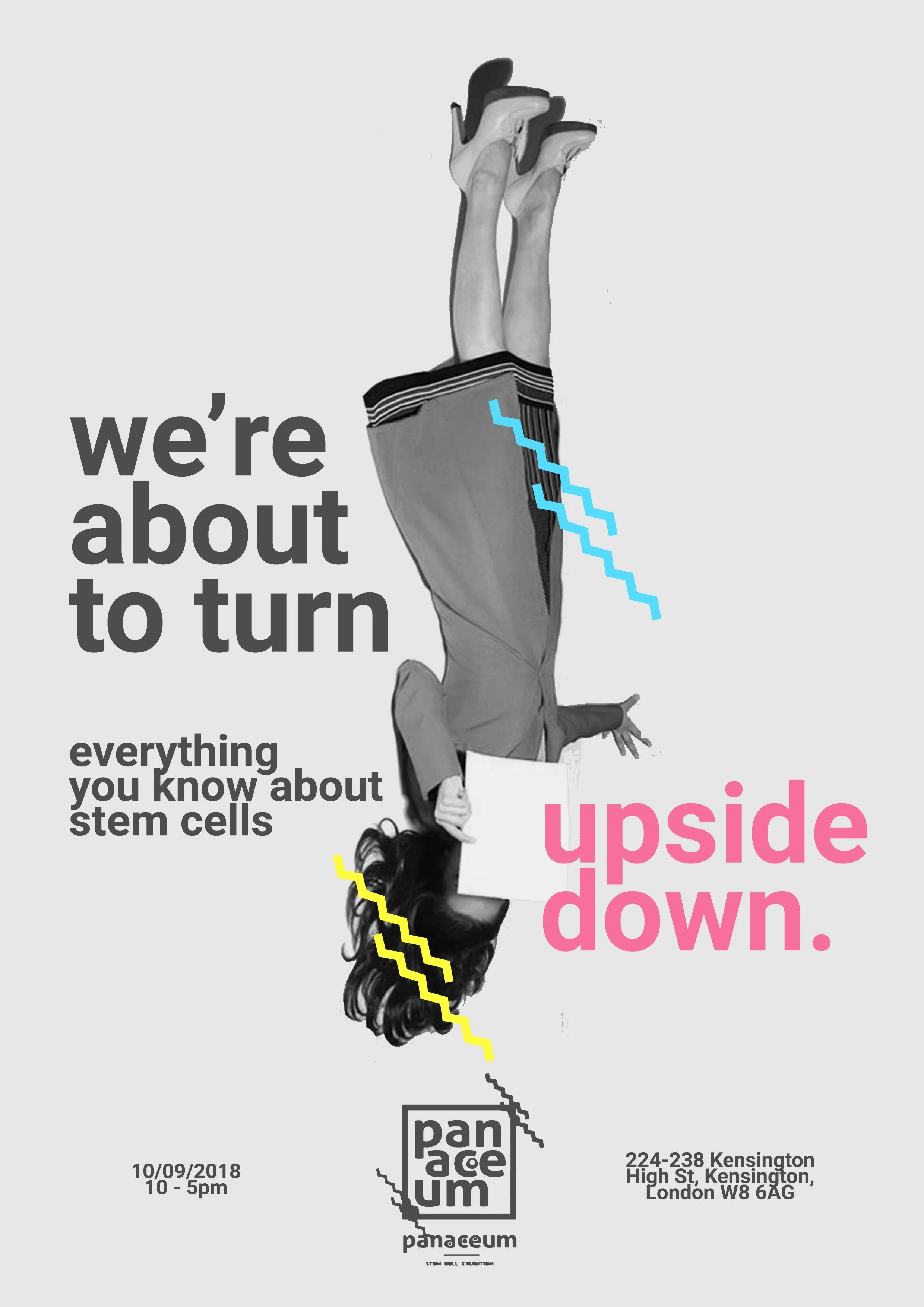
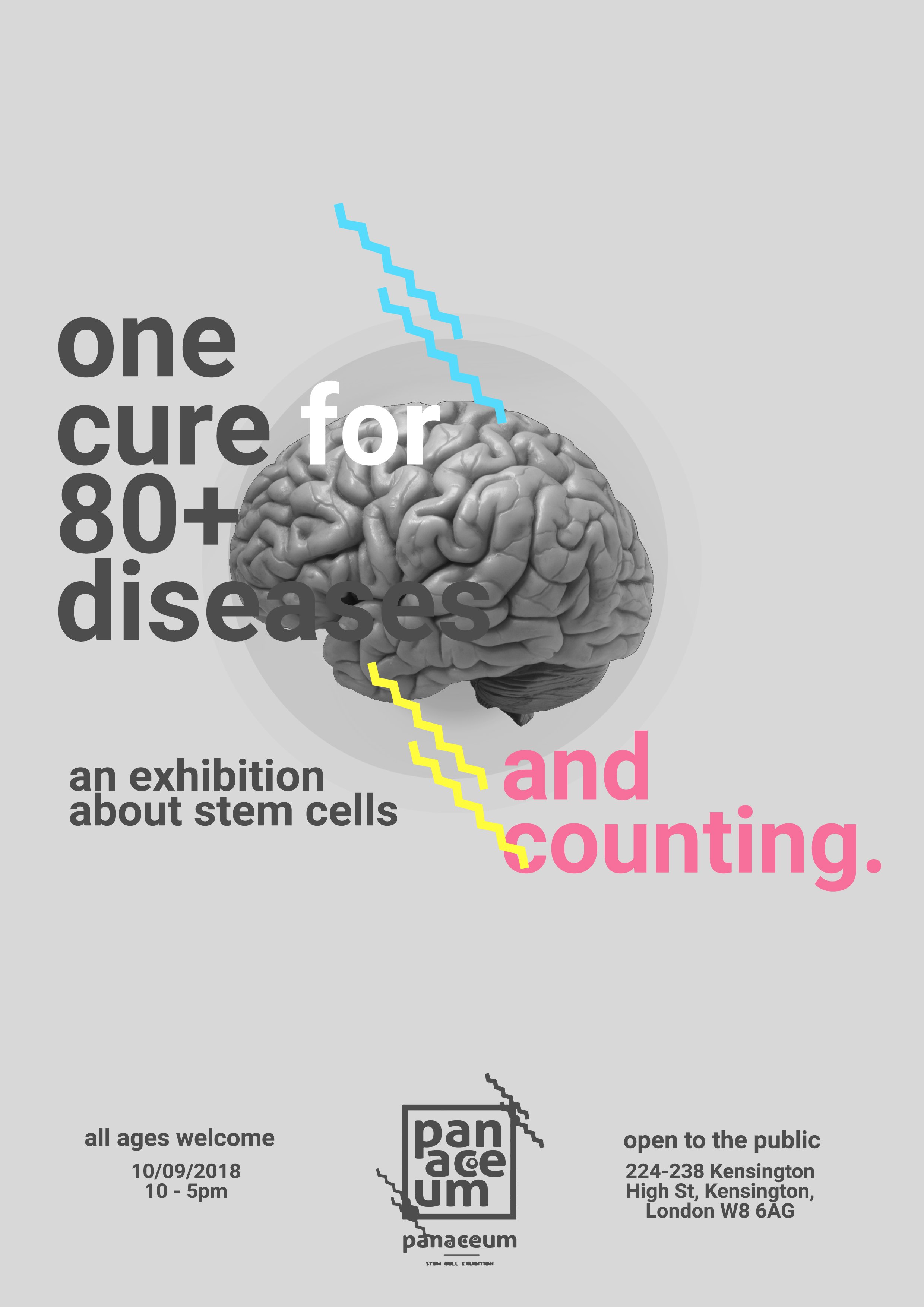

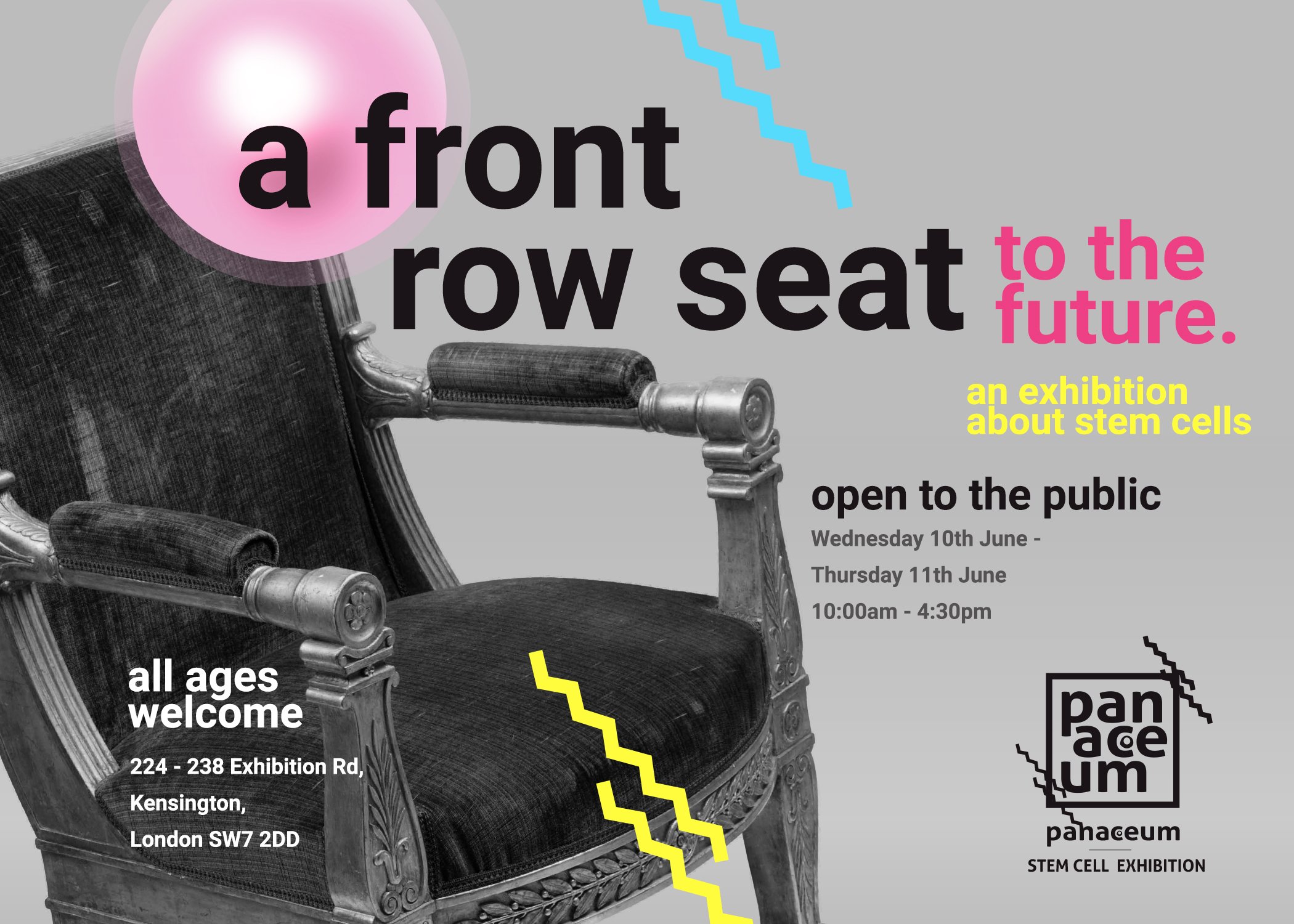
Flyers & Posters
Flyers and poster designs shown here were developed in photoshop and illustrator. I wanted to drive home the idea of organs or representations of the body in general that typically could fall into disrepair (represented by the greyscale coloring) could benefit from a revival via stem cells (using color to represent a link to the vibrant colors shown throughout rest of the project).
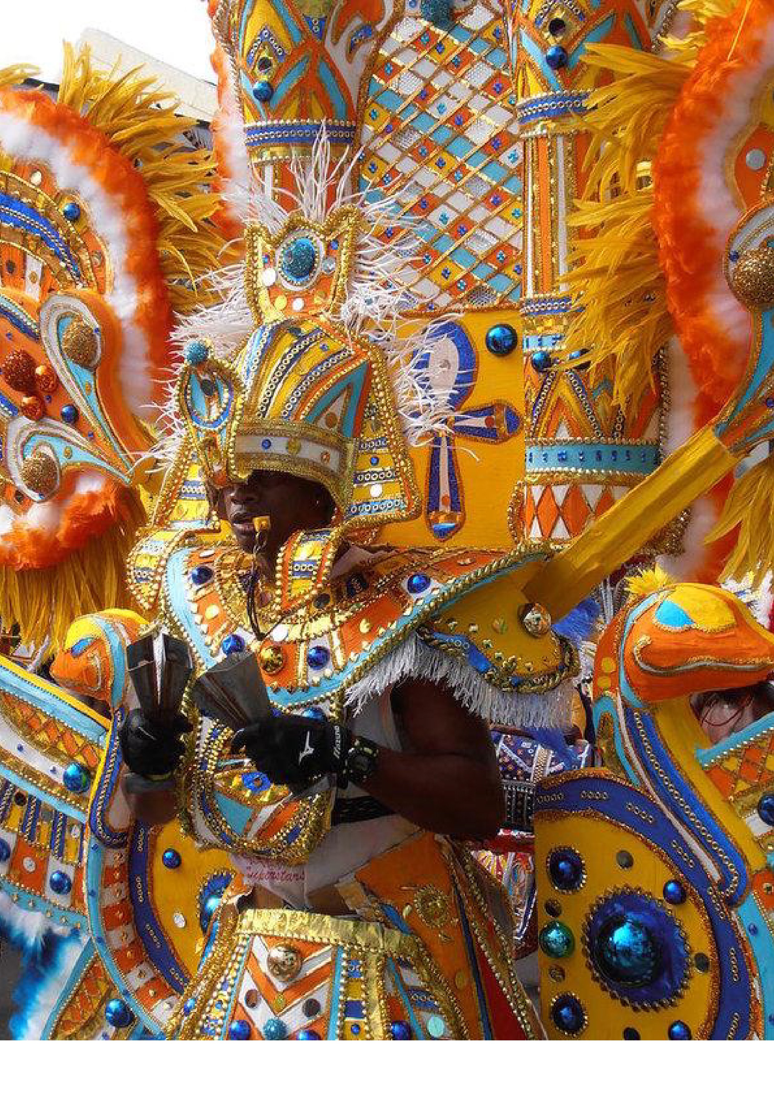
Key elements like feathers and cowbells were good opportunities to translate to ideas like wings, etc.
Year
2019
The Solution
A colorful, bold approach to encompassing as many elements of Bahamian culture as possible
Client / Purpose
Junkanoo Wings
The Problem
Client requested branding for a Junkanoo themed wing truck
“Junkanoo” is a street parade featuring music, dance, and costumes with origin in many islands across the English speaking Caribbean every Boxing Day and New Year's Day. It is an integral part of Bahamian culture and a very important part of their identity. It is often bold, loud, colorful and carries a very celebratory and competitive mood. I wanted this idea to show through my choices in design.
Project Type
Branding
Software Used
Photoshop / Illustrator

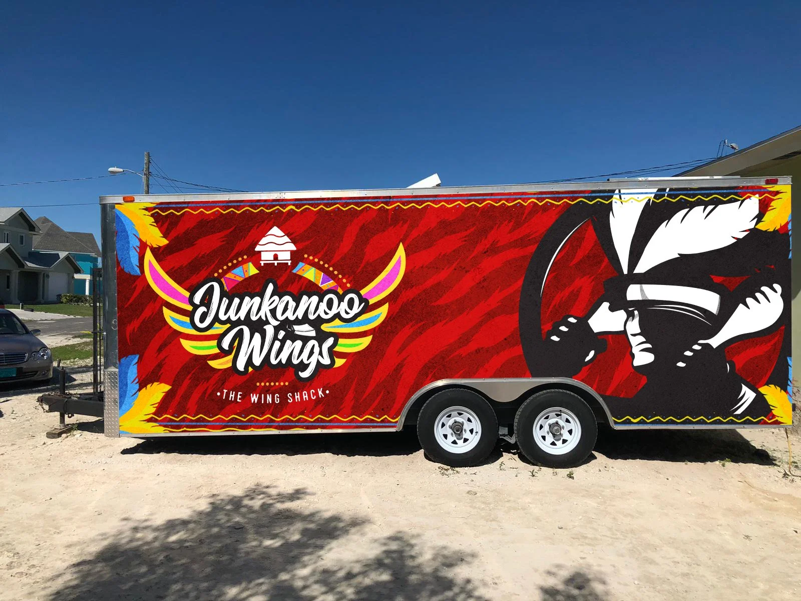


Truck Wraps
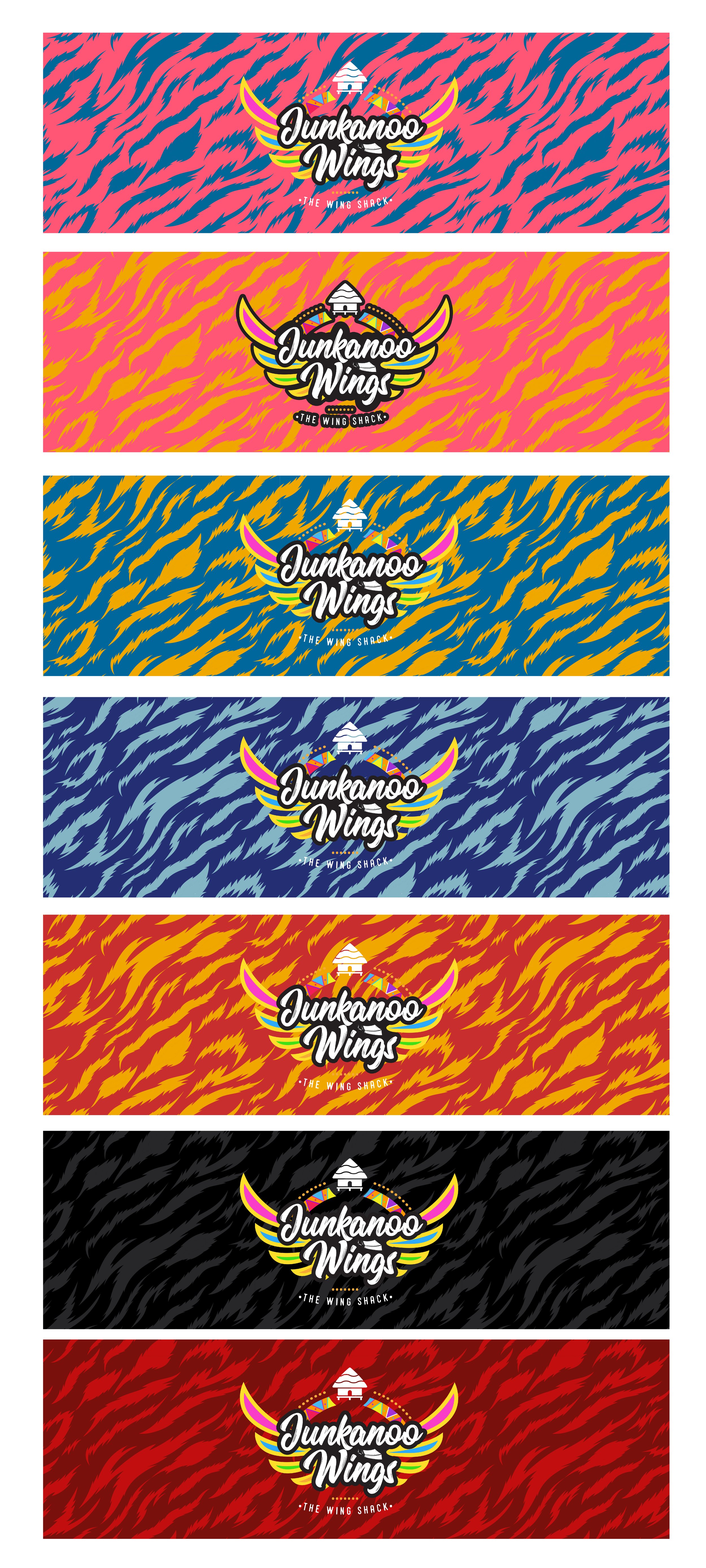
These designs were made for separate trucks to demonstrate possible different flavors and themes through the future and how the elements developed would translate.

Ideas & Inspiration
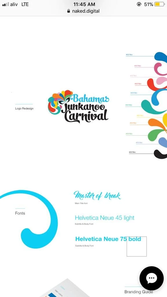
At the time of this project the Bahamas was starting to develop a revamping of its design language across its national identity. I wanted this brand to maintain the modern feel things were transitioning into. Shown above are alternatives I developed and the places i drew my main inspiration from.


